- Typography (this one)
- Colors and Tiles
We are lots around waiting and watching for the next Windows. We are not just waiting for the desktop to come back, we are waiting for something that will make us happy and excited! I'm not a UI designer, I'm just a developer using Windows, but I love good visuals and I'm concerned by the OS UI that accompanies me all along more than 12 hours per day!
I won't comment more on the next Windows OS, but I would like to take the opportunity to share some of the unpleasant things I'm feeling about for the past years with the Windows Metro UI era.
Preamble
I remember reading the old document of the Windows Phone design philosophy when it came out (I have found just one around) and the first two major pillars of the Metro philosophy were :
1) Clean, light, open, and fast: It is visually distinctive, contains ample white space, reduces clutter and elevates typography as a key design elementThat's the original seed and... original sin.
2) Content, not chrome: It accentuates focus on the content that the user cares most about, making the product simple and approachable for everyone
First, considering that a UI OS is like a transit area, a metro or an airport. I barely spend a whole day in a metro/airport and I don't think I would love to. While this design philosophy can be successful for some applications (like news, because this is one place where the content is more important than the chrome), it is questionable to apply it everywhere.
Do you typography?
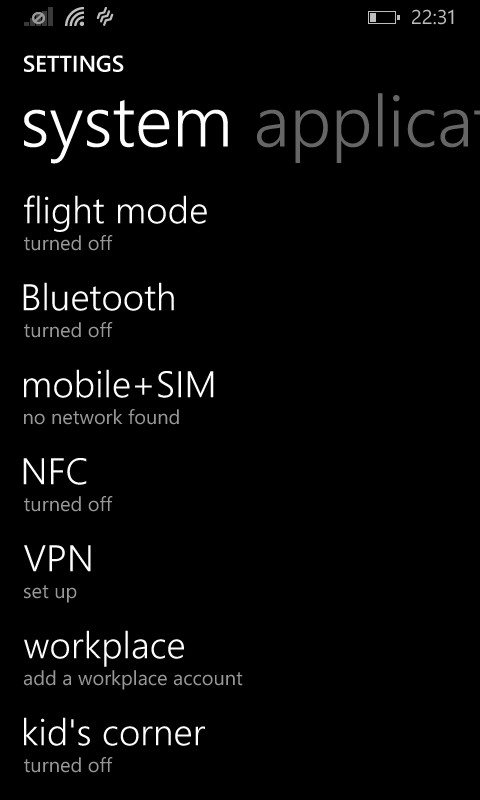
Let's take one of my favorite example: The settings of Windows Phone and this apply to some extend to the settings of Windows 8.x. Here are the screenshots of all the settings that are scrollable on a windows developer phone I have:
It is composed of 7 different screens (!), 48 individual plain text entries just for the front settings! I have just added the second screen for applications, but some sub-screen-settings are suffering the same syndrome...
I have found this UI to be one of the most unpleasant settings area I have been using for the past years over the three major mobile OS. Every time I have to use this area, I'm struggling to scroll down, scroll up, blinking my eyes to find - and miss the entry I'm looking for. It was even worse with Windows Phone 8, as it didn't have an accessible notification/simplified control center from the home screen, so everyday, I had to deep dive into these settings to find the flight mode (2nd screen, first line!)
This is where typography is abused. It has only content, and absolutely no chrome. Where are the:
- categories?
- icons?
- colors?
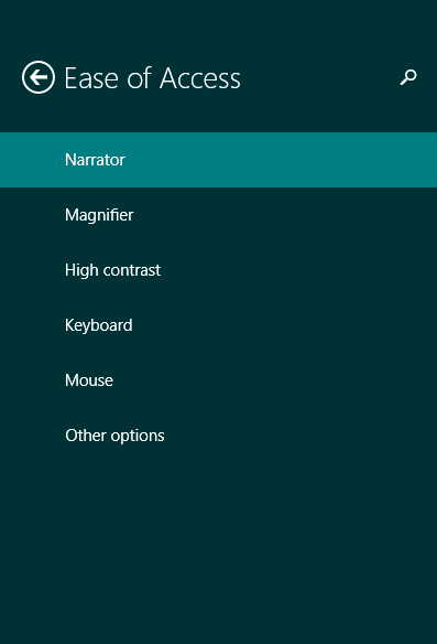
Let's just have a look at the Windows 8.1 version.
Not surprising whenever I have to change settings on my PC, I'm still going to the good old control panel. While it is lacking flat designs and refreshed icons, it is still much easier to access all your settings ( and you have much more there), than going around the new Windows 8.1 Metro settings.
Apart for the categories, we feel cold about colors and icons. Why banning them so hard?
Let's just have a look on the settings on my Android device:
 |
| Settings on an Android |
Visually, it is a bit more pleasant, even if I'm not a fan of the toggle buttons (not really a flat design), but overall, it is functionally a lot more usable. My grandpa with its weak sight is much more able to handle these settings than the one from Windows.
Perceptually, psychologically, without being an expert, I believe this is wrong. Many people, probably starting by myself, are not comfortable with pure text, language, reading...etc. My kids that are not yet able to read would not be able to navigate in these settings (even if they should not have to!).
Our brain have different ways of deciphering information, based on text, form, colors, spacial placement, sound. Some people can perfectly handle all this text, some can't. Leveraging only on typography, on a single axis of chrome, is making some people confused about this.
This division of content and chrome is hurting more than it sounds, drying the chrome is drying the content! It is essential that the substance and form come together.
For the next part, let's talk about colors and tiles!
Stay tuned!


